Outbrain’s dashboard is packed with powerful campaign insights that can help to inform your performance optimizations. It’s okay if you don’t know where to start; below, we’ve pointed out a few main areas to pay attention to when exploring the dashboard. You can always schedule a report so that it’ll be sent to you automatically.
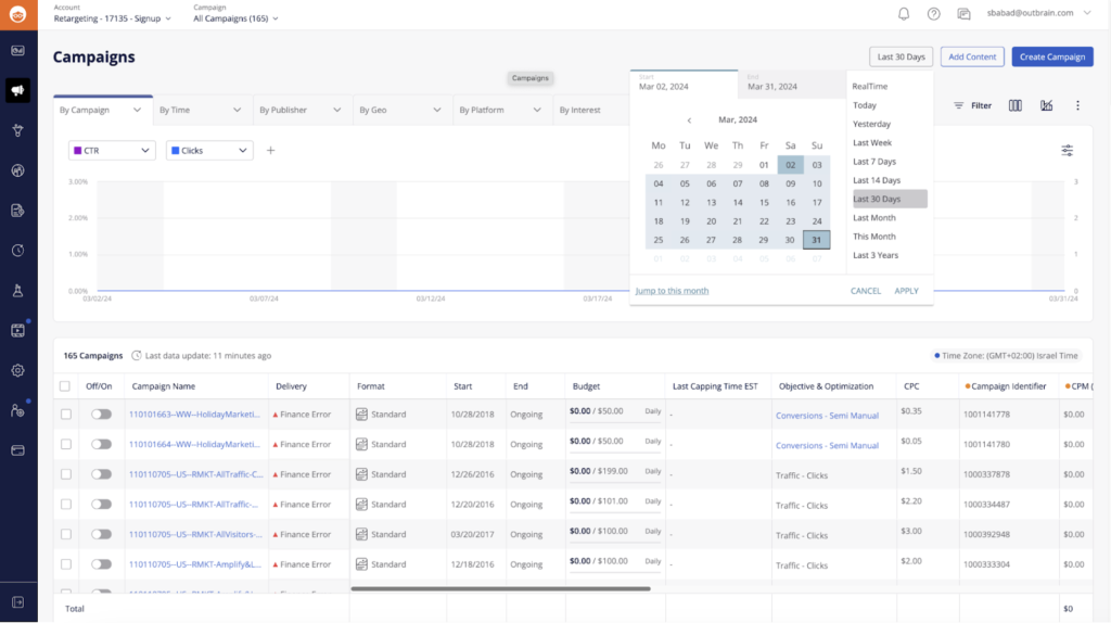
By Date Range
Click on the ‘Last 30 Days’ icon on the top right of your Campaigns dashboard, and adjust the time to a pre-set or custom date range. If you select real-time view, you will see the data for the last hour or the last 6 hours.
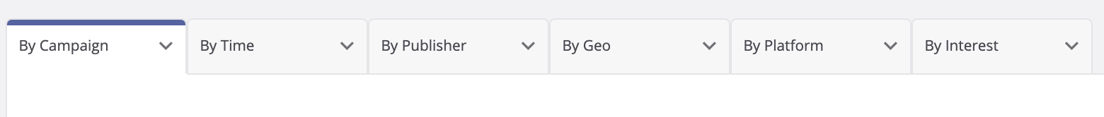
Data Groupings
Choose how to section out your data by clicking on the breakout folders above the graph.
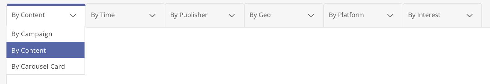
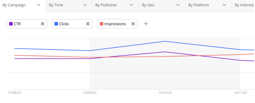
By Campaign
- By Campaign: Provides reporting at the basic campaign level
- By Content: Provides reporting at the ad level, including all creative formats
- By Carousel Card: Provides reporting for the Carousel format at the individual card level
By Time
- By Month
- By Day & Hour
- By Day Of Week
- By Hour Of Day
- By Date
By Publisher
- Publisher
- Section: Sections are categories within the publisher’s page
By Geo
In this view, you will also be able to click on an interactive map that displays various metrics based on each location. Keep in mind, DMA is a US-based metric; global users can target more specific US-demographics using “By DMA.” We do not display data older than April 2017.
- Country
- Region
- DMA (USA Only)
By Platform (or Device)
This tab enables you to filter reporting by:
- Platform (device)
- OS (device operating system, such as iOS or Android)
- Browser
Please note, when setting up your campaign, it’s best practice to split up your campaigns by device, as the CPCs vary and breaking them out will give you more control to optimize.
You can use the “By Platform” tab to filter your campaigns by their designated device. The visualizer will plot the data and date range selected. You can view spend, clicks, and other metrics here.
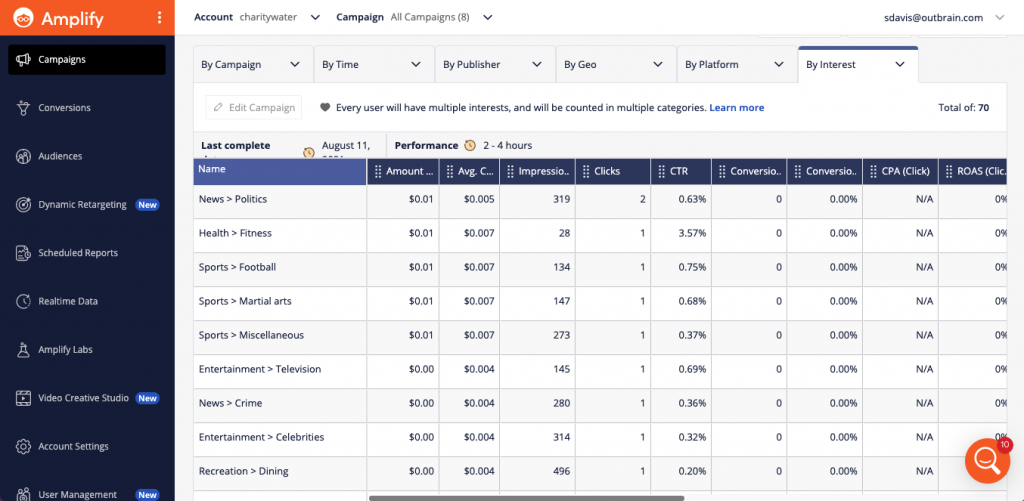
By Interest
View the interests of the audiences engaging with your campaigns. For more information, check out our By Interest Reporting guide.
Comparison Data & Time Frame
You may compare sets of performance metrics that are most important to your campaign strategy, and map them out on the data visualizer. Select these from the + sign above the chart to plot them out.
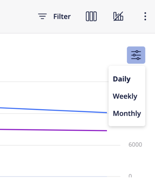
You can also select the time interval that each data point will represent, either by daily, weekly or monthly.
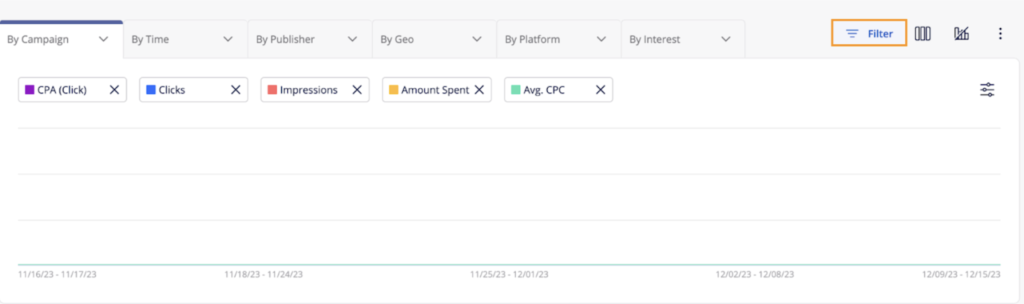
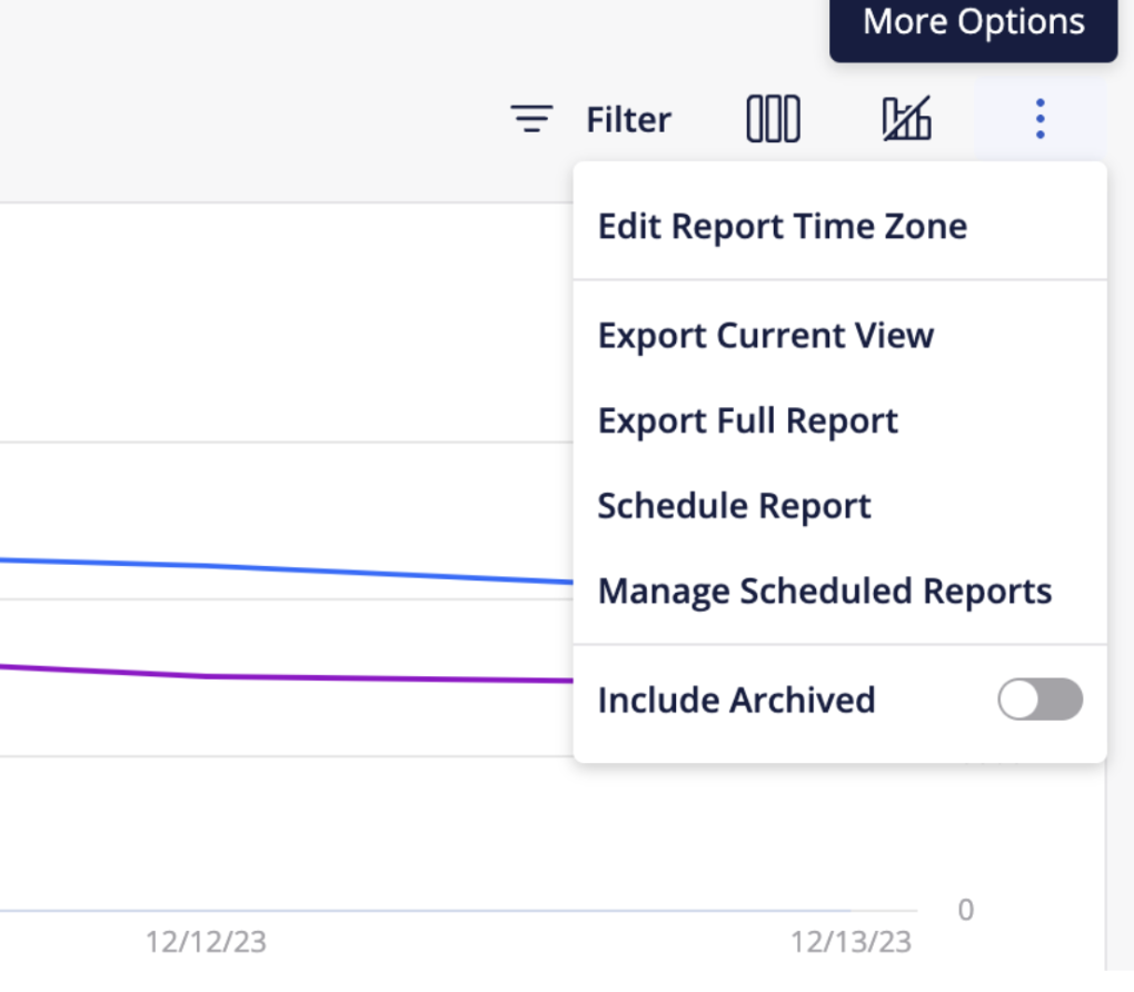
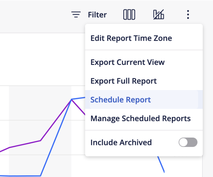
Reports & Filters
If you have specific KPIs against which you’re measuring your campaign success, you can add any number of filters to your reporting. Click on the “Filter” button to enable this view.
Then, select from the filter(s) at the top of your performance visualizer. For each filter, you may enter values that are relevant to your analysis.
Specific Campaign Performance
If you’re only interested in viewing the performance of a specific campaign and its content, click the campaign name and view custom reports on its “By Content” view.

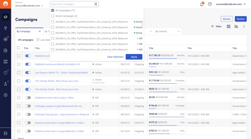
You can also select multiple campaigns at once to view their performance. This is especially valuable if you are running campaigns on separate devices. To do so, you can click on the downward-facing arrow next to “Campaign” at the top left-hand side of your screen. A search bar will appear, displaying campaigns sorted by their status. You can then personalize your reporting grid by selecting the checkboxes next to the campaign names that you wish to view.
For later review, or for application against future campaigns, you can refer back to your Campaigns dashboard, or export the data from the top of your dashboard view.
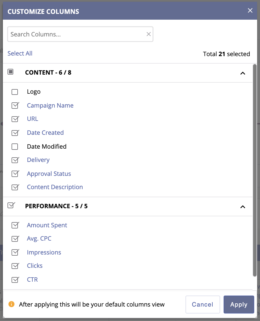
Customize Columns
If you want to create a customized view of your dashboard, click on the “Columns” button near the top right-hand side of your screen to select the format of your dashboard. Once saved, your dashboard will load the specific layout you’ve chosen whenever you log in.
Scheduling Reports
You can schedule reports to be sent at a customized frequency (daily, for example) to select email addresses.
To schedule a report, click the “Schedule Reports” option under the “Reports” button in the upper right-hand corner of the dashboard, or select the “Scheduled Reports” button on the left-hand side rail.
On the “Create a Scheduled Report” window, you’ll be able to customize how frequently you’d like to receive the report, the reporting period you’d the report to cover, the date range you want the report to run (up to one year), and which email addresses you’d like the report to be sent to. Reports can be sent to up to 10 recipients.
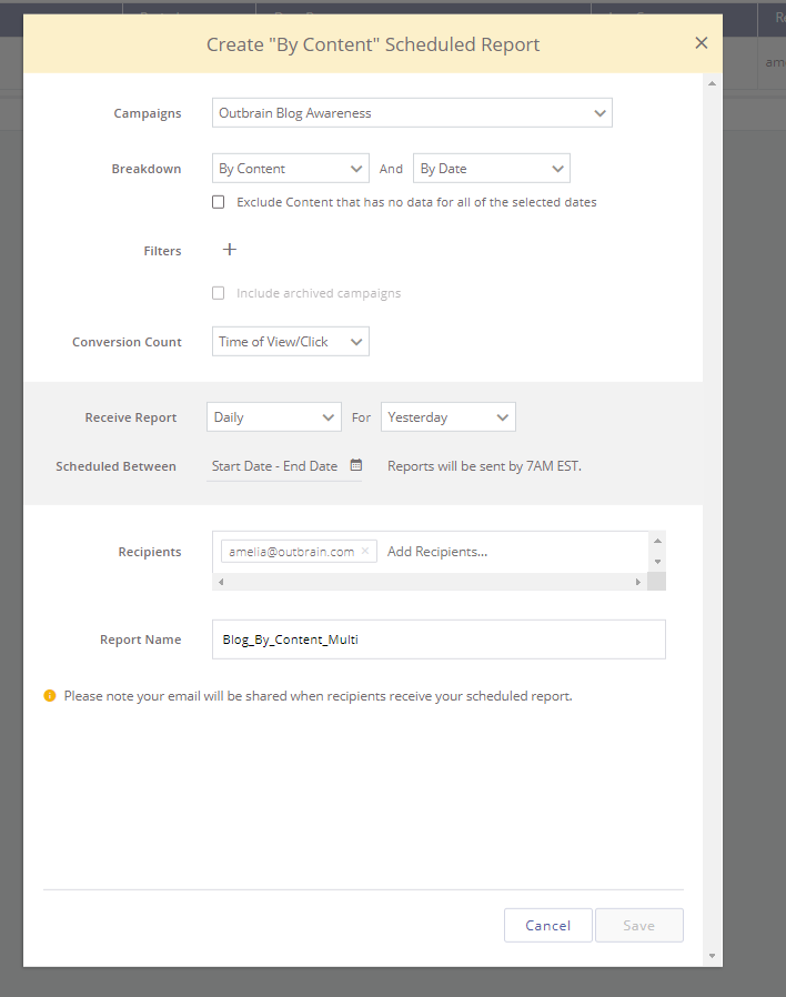
You can also select multiple dimensions when you schedule a report, allowing you to view your campaign performance by more than one section.
The following multi-dimensional options are available when you schedule a report:
- By Campaign AND By Date
- By Content AND By Date
Use the Breakdown fields to select the dimensions of your report. We also recommend that you select the option to Exclude Content/Campaigns that have no data for the selected dates so that your report only includes useful data.
Manage Reports
To manage your scheduled reports, click the “Manage Schedule Reports” option under the “Reports” button or click the “Scheduled Reports” button on the left-hand side rail of the dashboard.
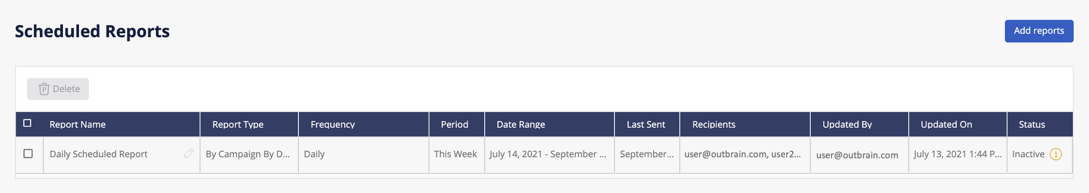
Within the Manage Reports section, you can review the scheduled reports’ details and status, edit your existing scheduled reports, or delete scheduled reports. You can have up to 10 active reports at a time. Scheduled reports will become inactive once their set date range has ended or if all recipients unsubscribed/were manually removed from the report.
Monitor key data in the Overview dashboard
If you want to easily monitor most essential data for your account or selected campaigns, we suggest using the Overview Dashboard.
The Overview Dashboard centralizes key performance metrics on a single graph, shows the campaigns with the biggest changes, and displays network trends, all within a single, intuitive screen. This enables you to instantly access actionable data and act fast when optimizing your campaigns for success. Learn more here.
Key Takeaways
- Data in the Amplify dashboard is split up into two sections: “Settings” and “Performance.” All of the data under “Performance” (Amount Spent, Conversion data, Clicks etc) is subject to a 2-4 hour reporting delay.
- Data recorded under “Settings” (Budget, Delivery, CPC, etc) is in real time. One metric to pay close attention to is the “Budget,” as it will display the updated spent amount under the budget you had set.
- When viewing a region or DMA report, you may see traffic listed under “Other.” This pertains to traffic that is unrecognizable by our IP locators. You will not be charged for clicks outside of the locations you are targeting.
- For reports that you schedule, please note that your email address will be shared with the recipients when they receive the report.
- Scheduled reports will be sent by 7AM EST.
- Unlike manually exported reports, the scheduled reports will include data inclusive of the previous day’s data. It will not include today’s data.
- Multiple Dimension Reporting is only available when you schedule a report.
If you have any questions about reporting, you can email your Support Team with your account name and any relevant campaign names for assistance.